
01DESIGN CHALLENGE
To create a professional motion graphics composite using real Nickelodeon footage from the 2021 Kids’ Choice Awards Hero Spot: Blimp My Ride.
Working as part of a team, I will take responsibility for my assigned production role (Design Lead) while collaborating closely with others to
deliver polished, on air quality graphics, 3D animation, and compositing.
Working as part of a team, I will take responsibility for my assigned production role (Design Lead) while collaborating closely with others to
deliver polished, on air quality graphics, 3D animation, and compositing.
02 RESEARCH
The design centers on the iconic Nickelodeon blimp and leans into a bright, high saturation visual language
that feels playful, energetic, and instantly tied to the Kids’ Choice Awards brand.
The overall look suggests an audience of both kids and families, with signature Nickelodeon elements like
slime, bold color, and oversized graphic shapes helping create a fun, spectacle driven identity.
that feels playful, energetic, and instantly tied to the Kids’ Choice Awards brand.
The overall look suggests an audience of both kids and families, with signature Nickelodeon elements like
slime, bold color, and oversized graphic shapes helping create a fun, spectacle driven identity.
2022 Nickelodeon Kids' Choice Awards/Blimp
03 CONCEPT DEVELOPMENT
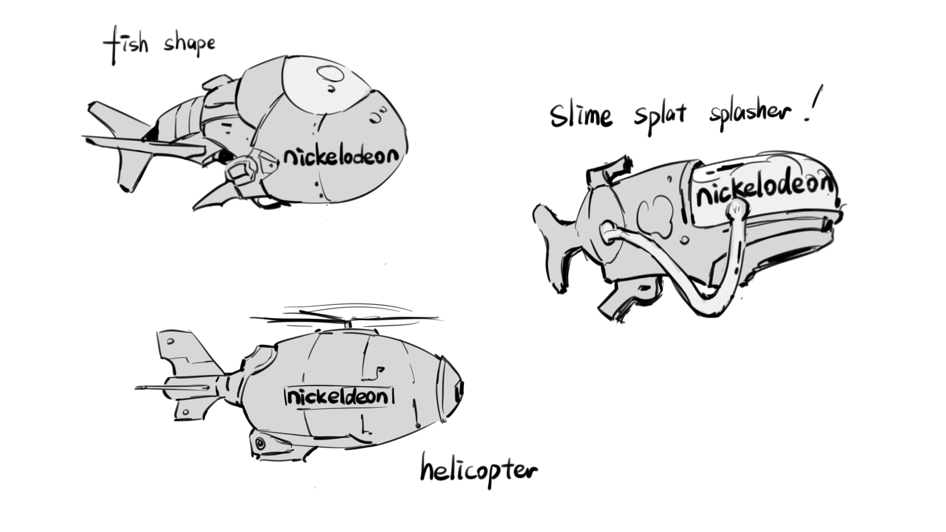
As the design lead, I developed multiple visual directions and blimps during the early concept stage,
and took primary responsibility for shaping the project’s overall design language.
I created and presented these two concepts, and direction 01 was ultimately selected as the foundation for the final piece.
and took primary responsibility for shaping the project’s overall design language.
I created and presented these two concepts, and direction 01 was ultimately selected as the foundation for the final piece.
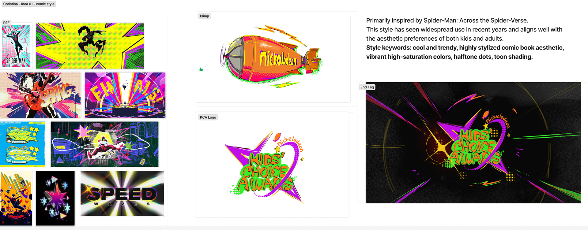
Direction 01 - Comic Style
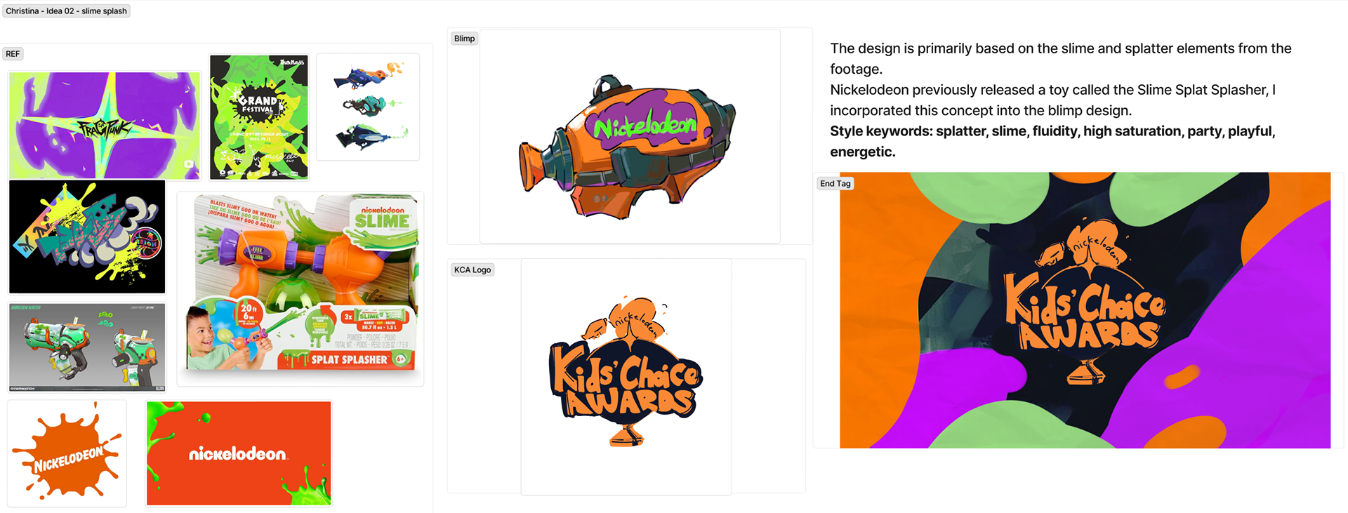
Direction 02 - Slime Splash
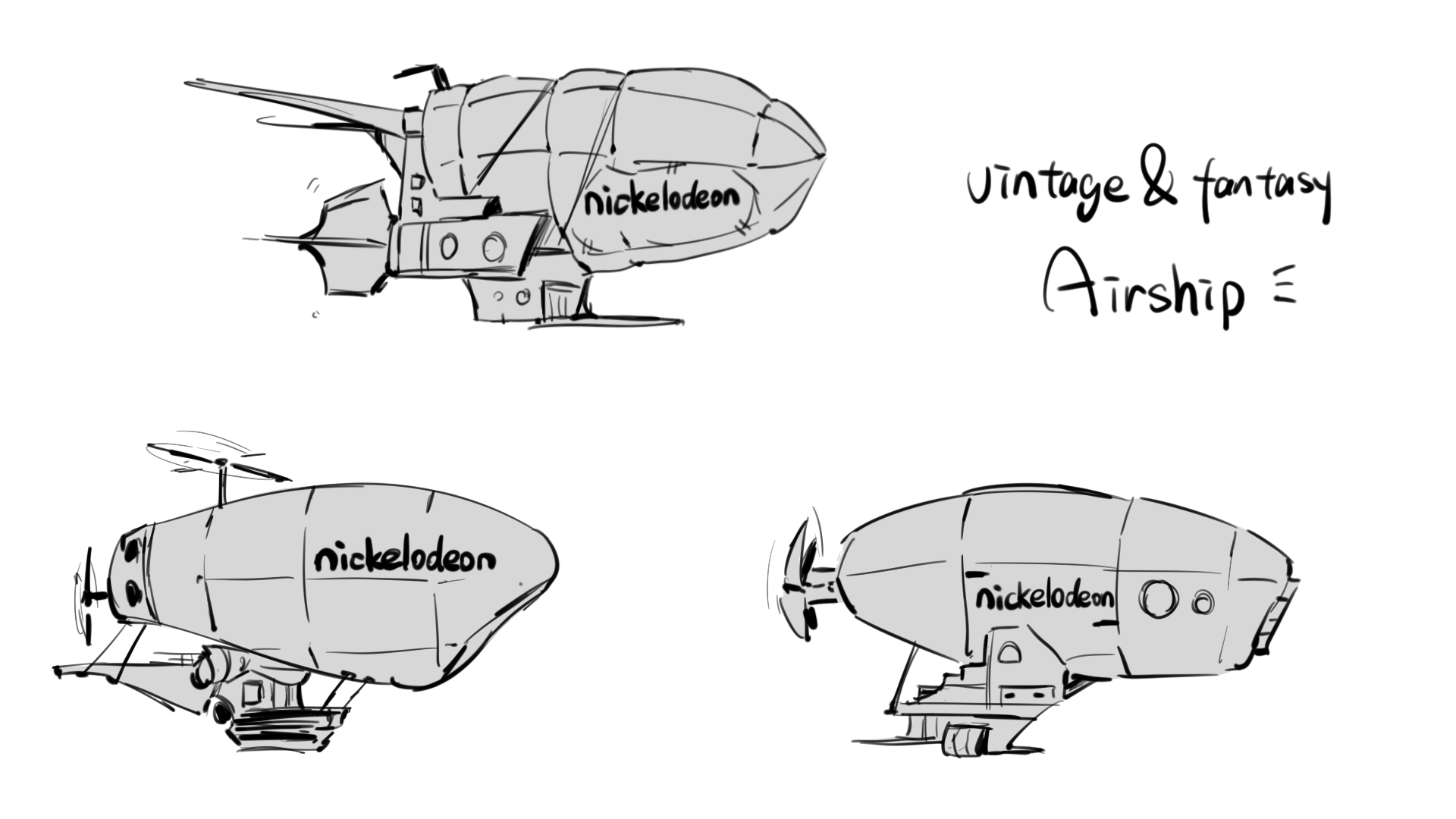
To ensure enough room for selection, I intentionally created a wide range of blimps during the design process.
The explorations included abstract, modern, more realistic, and more fantastical approaches.
After all, our faculty strongly preferred the fantasy airship direction on the very right side,
so I combined elements from two different airship designs and applied the comic inspired visual style to unify them.
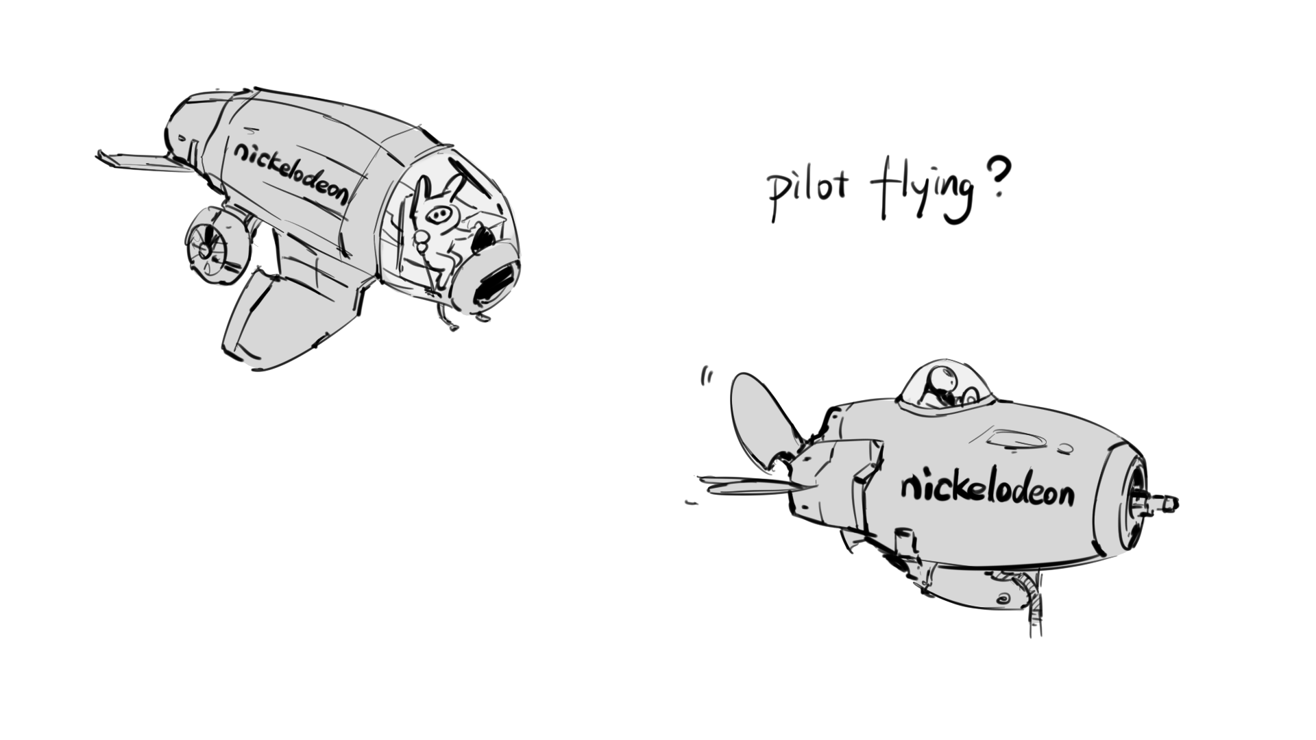
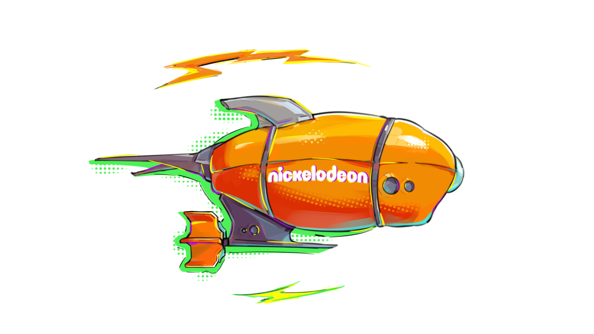
Through this process, I developed the final blimp design that was used in the project.
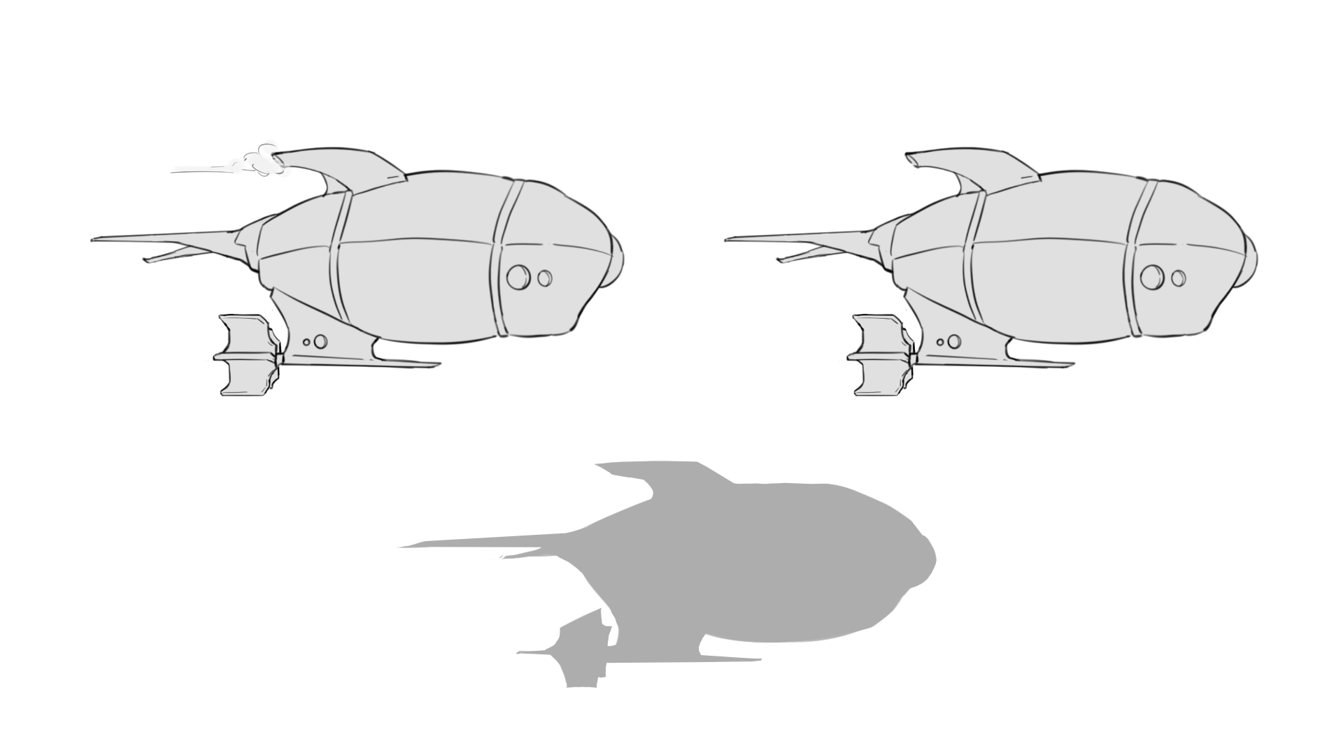
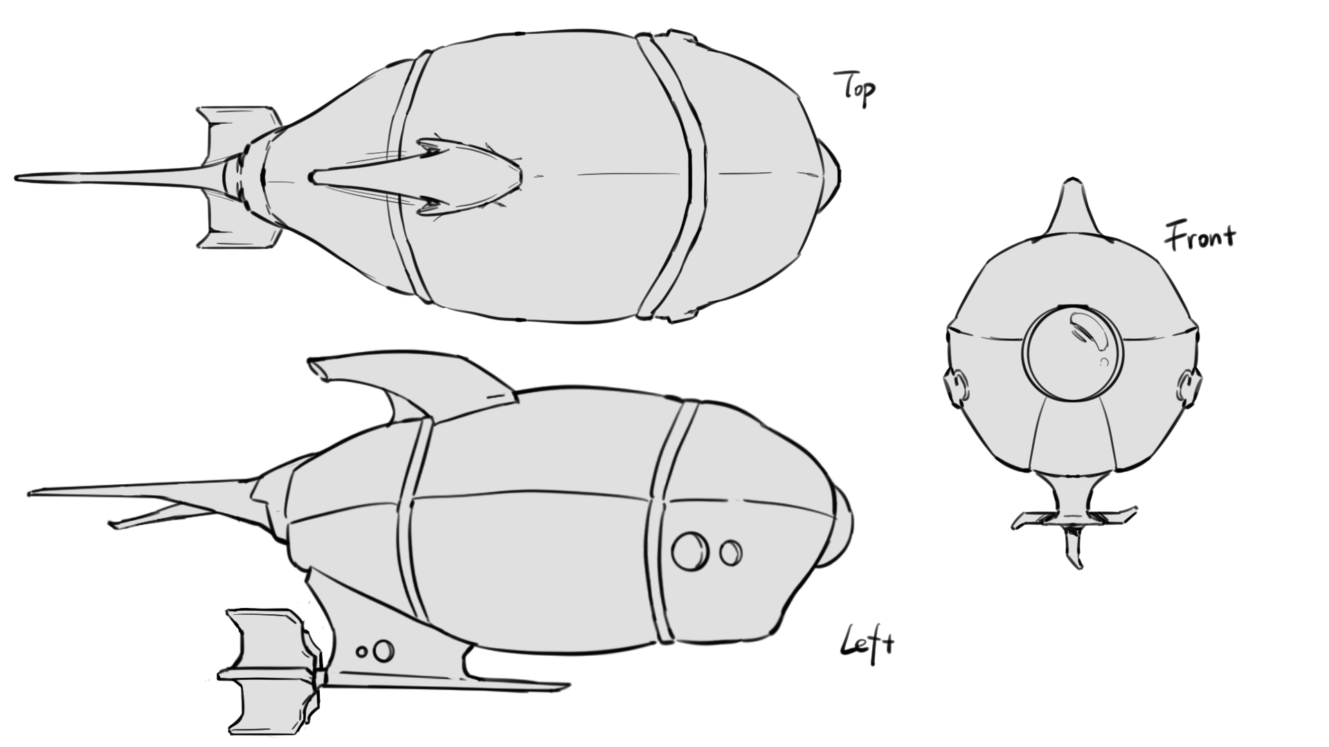
To align with the team member responsible for modeling, I also created three views to ensure visual consistency and to make the modeling process easier.
To align with the team member responsible for modeling, I also created three views to ensure visual consistency and to make the modeling process easier.
To help the live action footage feel more visually unified with our overall style, I created a visual guide and introduced cel animation effects that align with our design language.
The final implementation of this part was carried out by my teammate.
The final implementation of this part was carried out by my teammate.
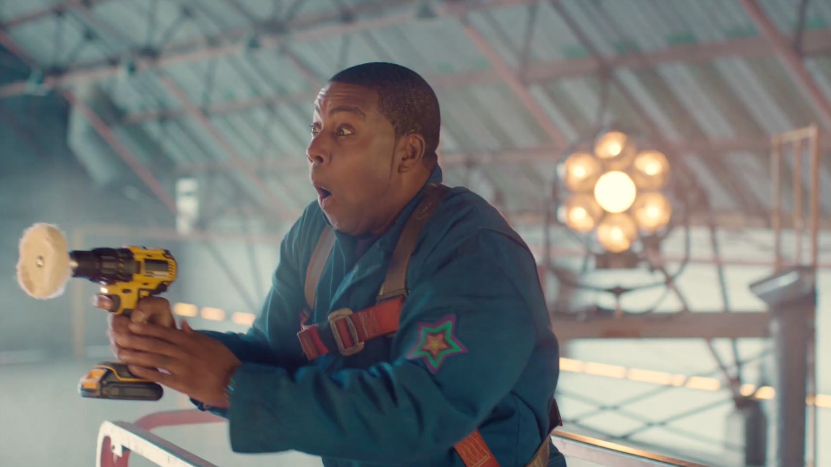
Original Footage
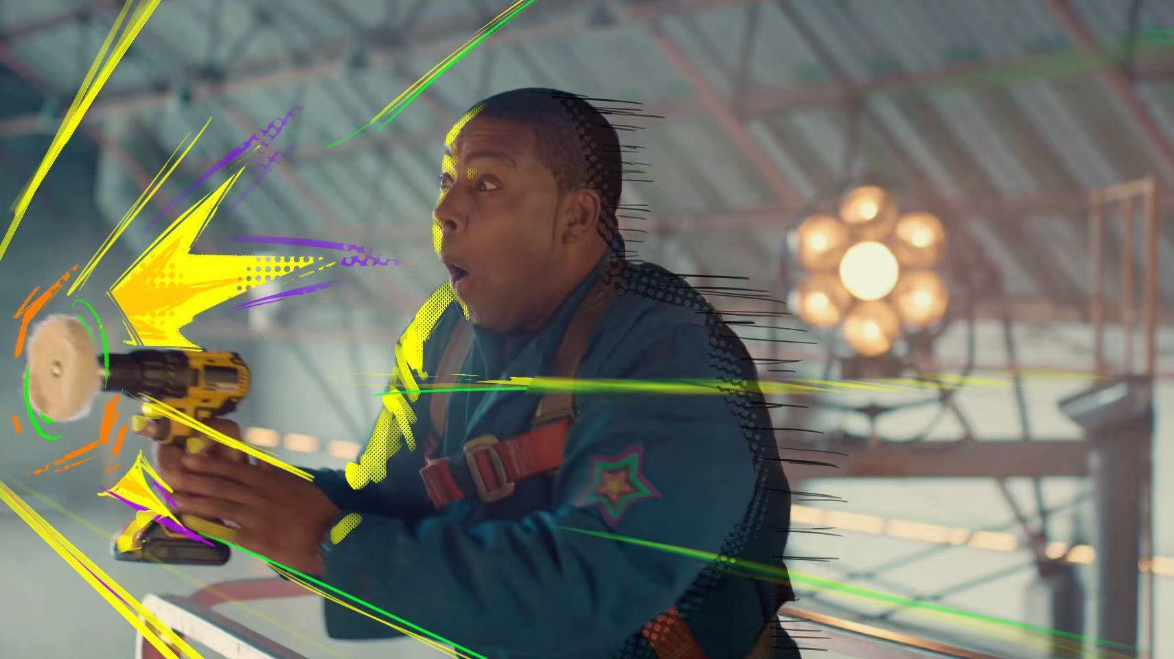
With Cel Effects
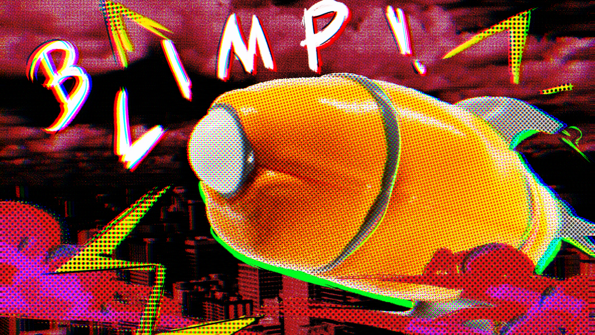
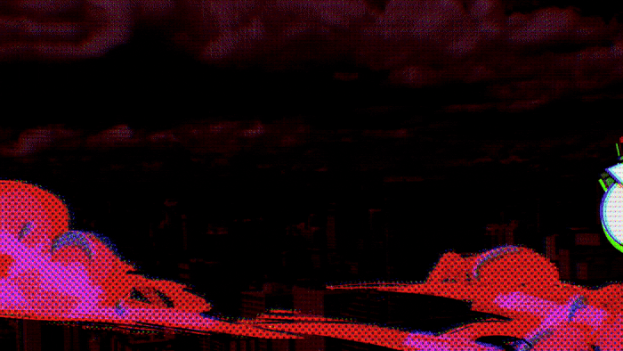
04 STYLE FRAMES
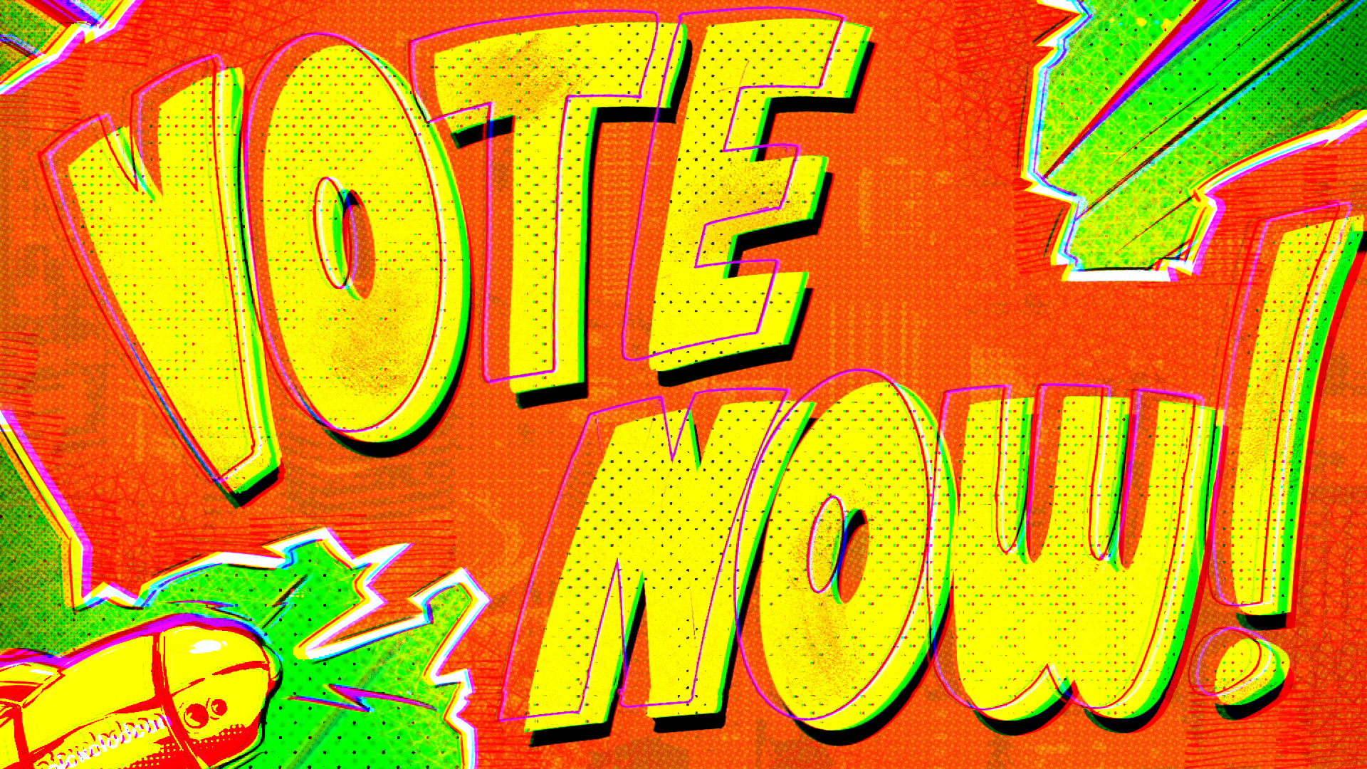
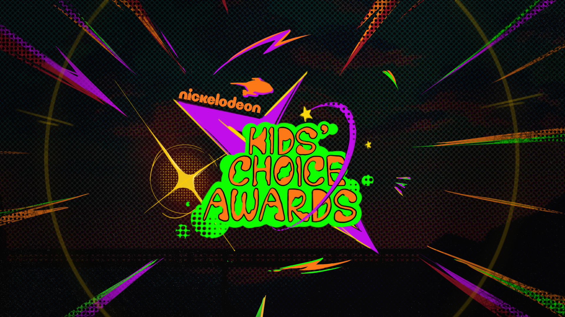
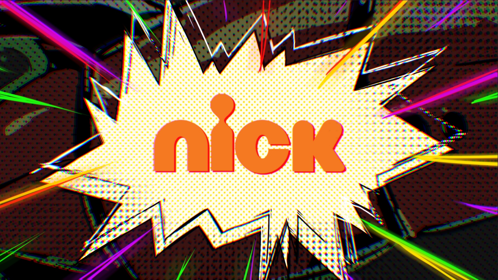
Some of the footage we received required full-screen style frames, and I was fully responsible for both the design and animation of this part.
Some of the footage we received required full-screen style frames, and I was fully responsible for both the design and animation of this part.

I think the main design challenges here were:
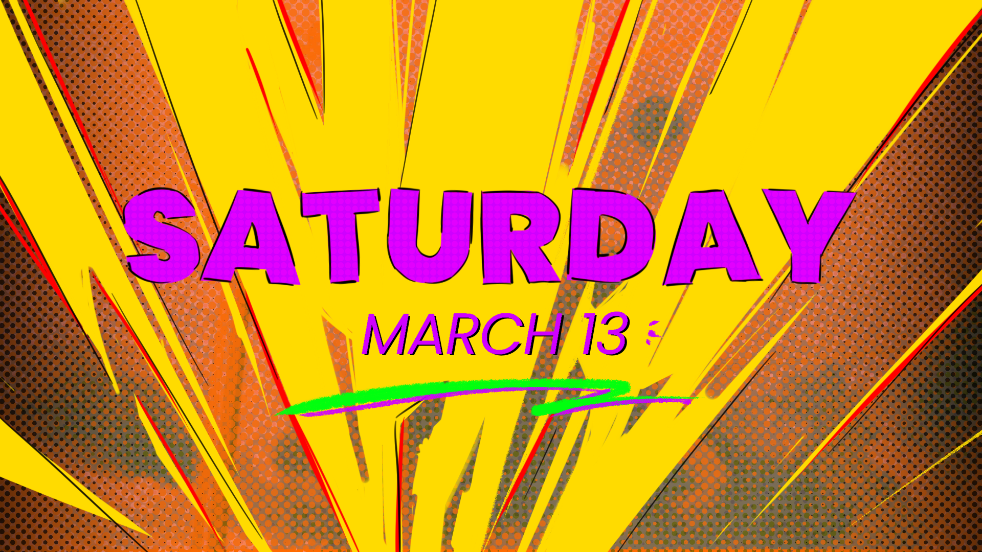
1. Keep the visuals appealing while using multiple highly saturated colors at the same time.
My solution was to rely on complementary color relationships, such as yellow and purple. I also subtly lowered the brightness of the secondary colors.
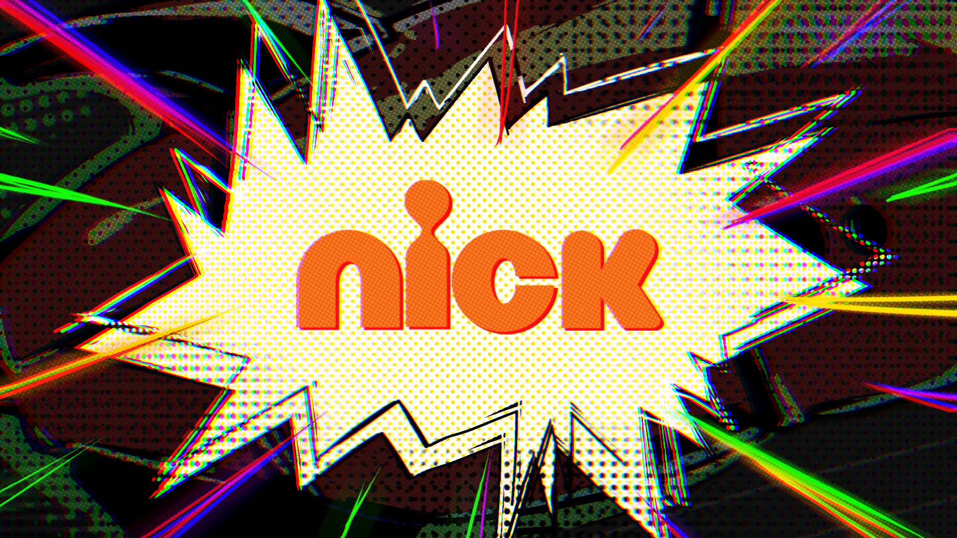
For example, in the first image, you can see that I mixed a large amount of black into the red background, which helps the main orange elements stand out more clearly.
2. Maintain orange as the dominant overall color.
My solution was that if the main object, such as the typography, was not orange, then the background needed to include a large area of orange in order to keep the visual language unified.
1. Keep the visuals appealing while using multiple highly saturated colors at the same time.
My solution was to rely on complementary color relationships, such as yellow and purple. I also subtly lowered the brightness of the secondary colors.
For example, in the first image, you can see that I mixed a large amount of black into the red background, which helps the main orange elements stand out more clearly.
2. Maintain orange as the dominant overall color.
My solution was that if the main object, such as the typography, was not orange, then the background needed to include a large area of orange in order to keep the visual language unified.
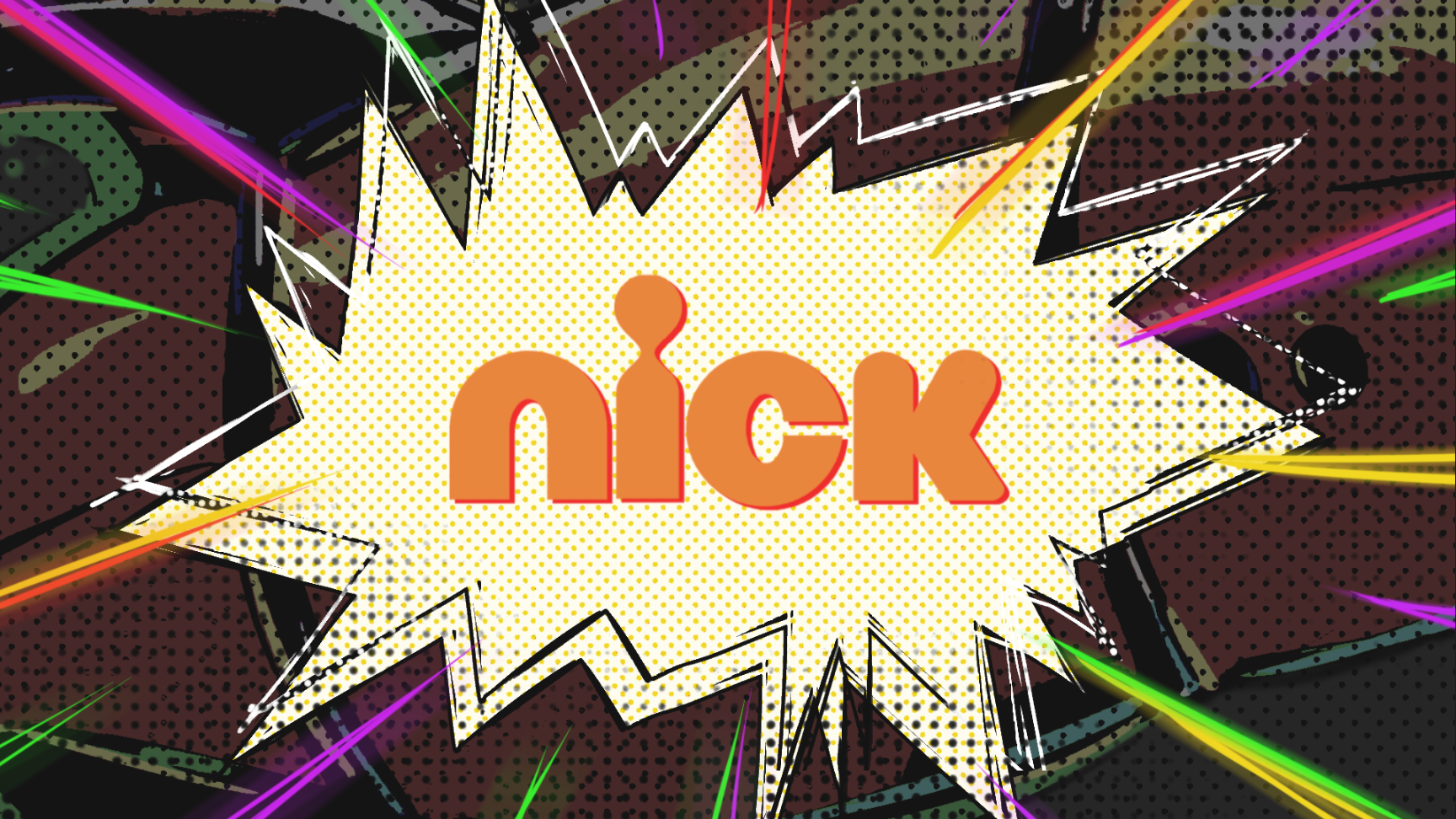
05 ANIMATION
During the animation process, one of the main feedback I received was that some style frames felt less impactful than others and appeared visually weaker.
Thus, I introduce more exaggerated motion. For example, I added a stronger reflective shine to the logo on the second pass below, more dramatic border shaking, and a black and white lightning effect during the transition from the "Logo" to “Saturday” to make the moment more memorable.
Thus, I introduce more exaggerated motion. For example, I added a stronger reflective shine to the logo on the second pass below, more dramatic border shaking, and a black and white lightning effect during the transition from the "Logo" to “Saturday” to make the moment more memorable.
First Pass
Second Pass
To achieve a better final result, I also animated and rendered the 3D blimp separately, after that I used material overlays to blend it into the 2D world.
Style Frame
Final Animation
In the final stage, I color graded the overall animation, slightly blur the edges, and added a layer of chromatic aberration to make the visuals stand out more.
Before
After