16x9 Ratio
4x5 Ratio
01DESIGN CHALLENGE
Make a tutorial introduces a new AI tool, demonstrates its creative process, and showcases the results.
The aim is to give the audience a clear understanding and inspire them to try it themselves
The aim is to give the audience a clear understanding and inspire them to try it themselves
02 RESEARCH
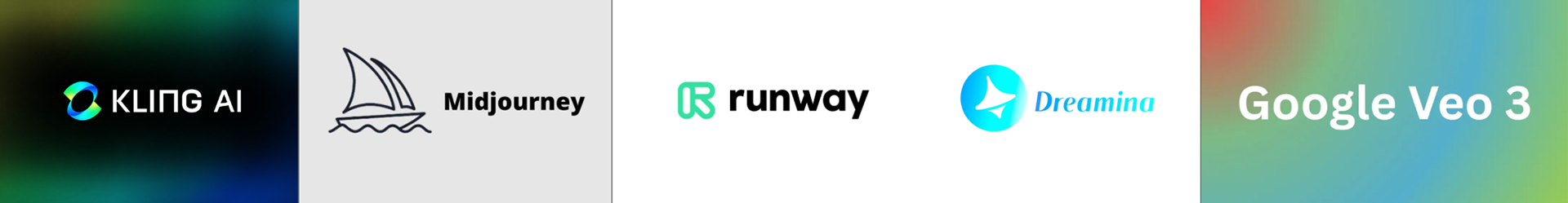
I have delved deep into studying and experimenting with the following art-related AI software:
Using them, I have created various case studies: Suno AI Music Video, Hybrid Character Design.
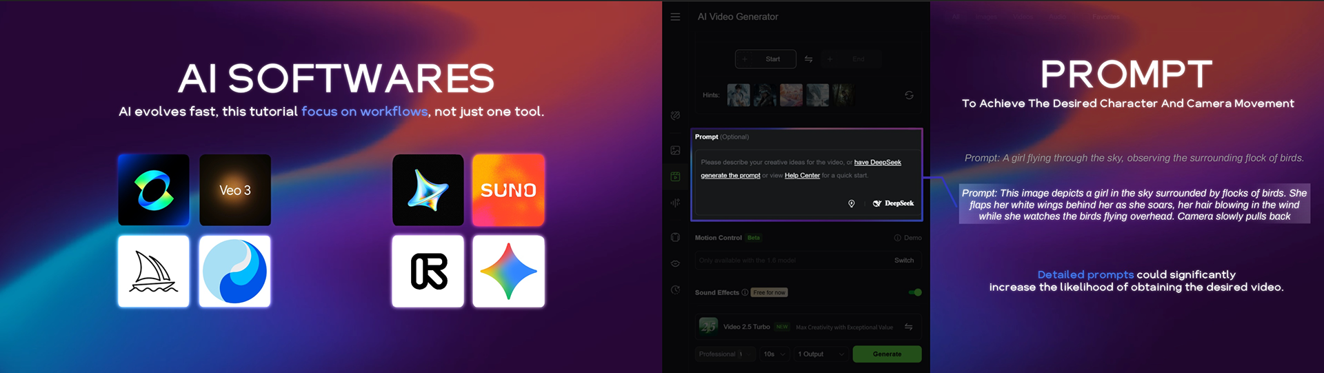
AI evolves fast, so the tutorial focus on workflows, not just one tool. Thus, even if new AI emerges, this video's purpose remains:
how to choose and utilize the right AI for each step of your creative process.
AI evolves fast, so the tutorial focus on workflows, not just one tool. Thus, even if new AI emerges, this video's purpose remains:
how to choose and utilize the right AI for each step of your creative process.
03 DESIGN APPROACH
Initially, I tired two different design approaches.
The upper one is inspired by the gradient and white color that commonly used in most AI software.
The upper one is inspired by the gradient and white color that commonly used in most AI software.
Approach 1
Approach 2
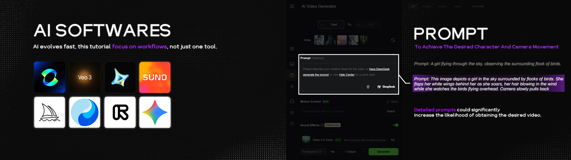
The bottom one is inspired by minimalist black and white feels clear and intuitive, perfect for instructional videos.
I eventually chose the bottom one, because everyone felt it looked more ‘professional,’ which makes people more willing to watch the tutorial video.
I eventually chose the bottom one, because everyone felt it looked more ‘professional,’ which makes people more willing to watch the tutorial video.
04 SCRIPT & AI VOICE OVER
Before officially starting, I decided to write a script to organize my thoughts and production process.
Not only would this let me revise it to make sure the video is clear, but it also makes it easier to use the script in AI software to generate the voiceover.
Not only would this let me revise it to make sure the video is clear, but it also makes it easier to use the script in AI software to generate the voiceover.
The voice-over software I used was Eleven Labs. I tested different settings and eventually fine-tuned the voice used in my video.
Since English is my second language, AI helped me greatly in producing a professional and clear English narration.
Since English is my second language, AI helped me greatly in producing a professional and clear English narration.
05 DIFFERENCE BETWEEN ANIMATION AND TUTORIAL
The biggest difference I noticed is that tutorial must be presented in a very direct and simple way.
For example, when I normally create animations, I tend to prefer more abstract designs that leave some room for the audience’s imagination. But this doesn’t work for instructional content — everything the audience hears needs to be translated as directly as possible into something they can see, avoiding any ambiguity.
For example, when I normally create animations, I tend to prefer more abstract designs that leave some room for the audience’s imagination. But this doesn’t work for instructional content — everything the audience hears needs to be translated as directly as possible into something they can see, avoiding any ambiguity.
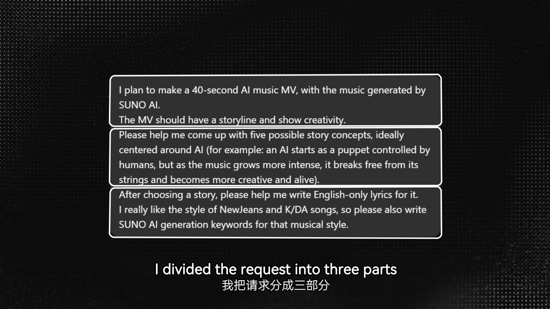
When the audience hears ‘three parts,’ clearly show the divided areas.
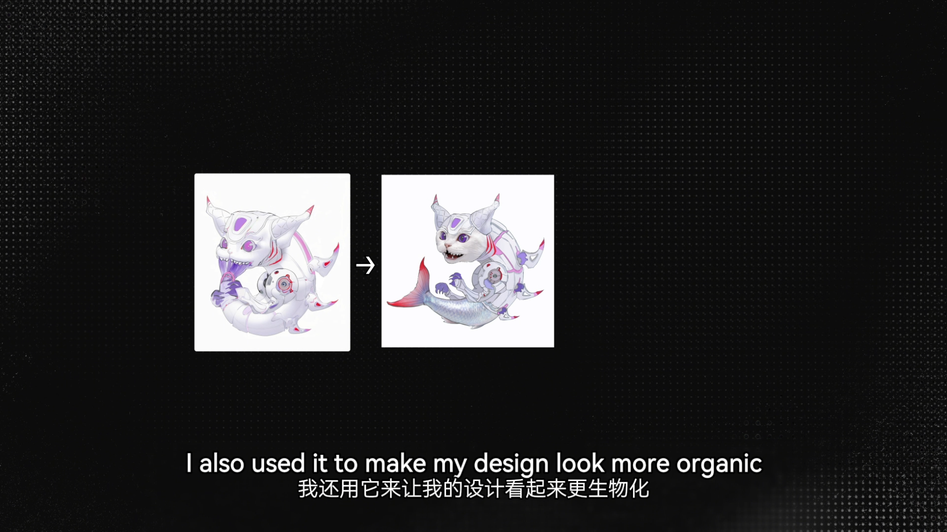
Show the audience the ‘organic’ result directly.
When I want to highlight details in my usual animation work, I might switch the camera angle or use lighting to guide the viewer’s attention.
But in a tutorial, the guidance needs to be much stronger, such as using the white rectangular frame with dimmed surroundings or zooming in on specific areas. These techniques might feel too ‘direct’ in normal animation, but they are exactly what teaching videos require.
But in a tutorial, the guidance needs to be much stronger, such as using the white rectangular frame with dimmed surroundings or zooming in on specific areas. These techniques might feel too ‘direct’ in normal animation, but they are exactly what teaching videos require.
Rectangular frame highlight
Zoom in highlight
06 TIPS
In my tutorial video, I included a few small tricks to help enhance the overall ‘professional feel’.
1. Sound Effects: Adding small, fitting sound effects during text movements or specific moments can capture the viewer’s attention and make the video feel more polished.
2. Glow Effect: I added a subtle glow behind most of the text and images. It doesn’t interfere with the visuals, but it makes the overall look feel more polished and textured.
3. Subtitle: Although the audience can understand your points just by listening, having subtitles always helps with clarity. This is especially useful when mentioning technical terms or unfamiliar names, such as ‘Kling’ which have uncommon spellings. Since Chinese is my first language, I also added Chinese subtitles. This helps the tutorial reach a wider audience and allows more people to benefit from it.
4. Timeline: In the 16x9 version of the video, I added a timeline on the left side. This clearly shows the audience what topics the tutorial will cover and helps them freely navigate and jump directly to the content they want to learn.
Overall, I think this was a very interesting project. I had never created a tutorial before, so it was a real challenge for me. At the beginning, I expected the final length to be around 5 minutes, but I kept wanting to add more details and clearer explanations—and it eventually grew to over 9 minutes.
Still, I think it was completely worth it. I gained a lot of valuable experience throughout the process, and I’m grateful to my art director and classmates for all the feedback they gave me!
Link to project slides: Click meStill, I think it was completely worth it. I gained a lot of valuable experience throughout the process, and I’m grateful to my art director and classmates for all the feedback they gave me!
Previous Case Study: Sesame Street x Netflix